Patient Empowerment Network
Reimagining Nonprofit Efficiency
ROLE
UX Researcher, UI Designer
CLIENT
Patient Empowerment Network
INDUSTRY
Healthcare Non-profit Organization
DURATION
2 Weeks
The Problem
The Patient Empowerment Network (PEN) is a healthcare nonprofit dedicated to supporting cancer patients. However, employees face challenges in effectively securing and managing donations—critical funds that directly impact patient care programs.
Without streamlined donation processes and efficient tracking systems, PEN struggles to maximize its outreach and provide consistent support to those in need.
The Solution
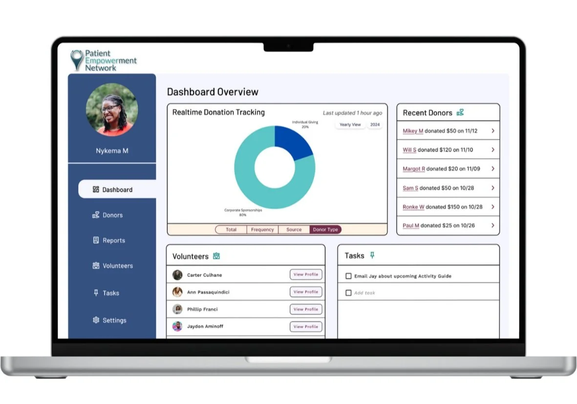
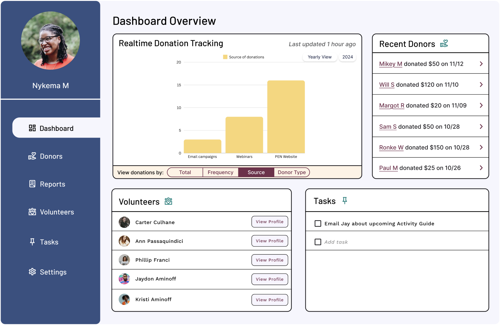
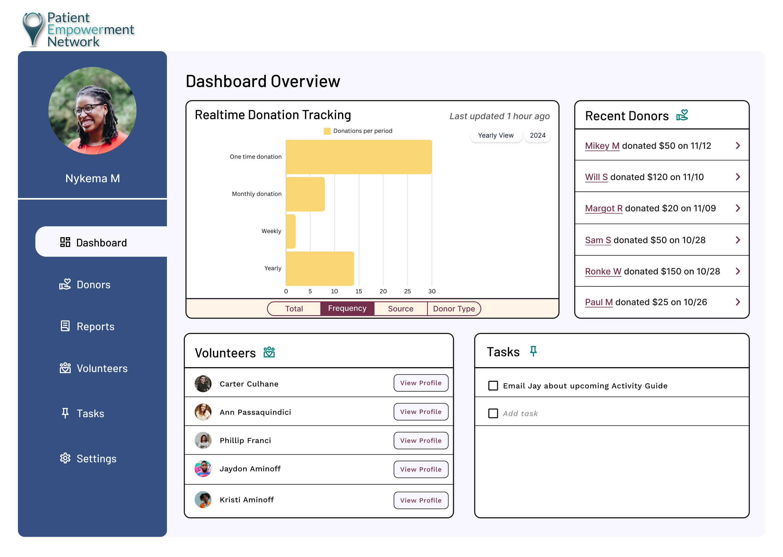
A comprehensive dashboard designed to streamline donation management by leveraging data visualization to provide real-time insights into donation trends and donor engagement.
This tool empowers PEN’s team to make data-driven decisions that enhance donor retention and maximize support for cancer patients and their care partners.
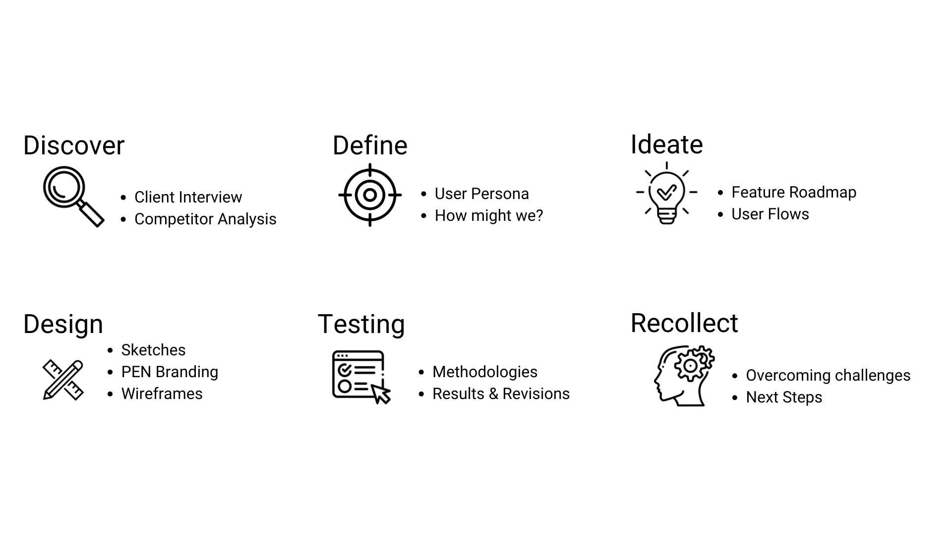
Design Process
Navigating the Nonprofit Landscape
Client Interview
A few years ago, the Patient Outreach and Engagement Coordinator for The Patient Empowerment Network (PEN), invited me to assist in creating informational media including videos and activity guides for their website. She is responsible for managing volunteers, overseeing social media and design initiatives, interviewing cancer patients, and regularly collaborating with the company's giving director.
Over time, we’ve maintained a strong working relationship, and she was eager to collaborate on this opportunity to enhance PEN’s reach and impact.
We scheduled an interview where she walked me through her daily tasks, goals, and challenges related to donation efforts, as well as the features she believes could better support her team.
From the interview
Streamlining Donation Tracking
Key Insights
Tracking the source of donations, the amount, frequency, and the donor's status (e.g., patient, care partner, survivor) is paramount for making data driven decisions.
Diversifying Revenue Sources
A key organizational goal is to diversify funding sources by increasing individual donations. Nykema expressed the importance of tools that could support these efforts, such as features to improve donor communication.
Competitor Analysis
To inform my design, I examined dashboards like YouTube Studio and Shopify to understand effective layouts and features. I also researched the World Wildlife Fund (WWF), a large-scale nonprofit, to explore how they present and manage information.
By prioritizing an intuitive, modular layout and incorporating interactive, actionable data visualization tools, the dashboard design can empower users to make informed and effective decisions about donations.
Feature Prioritization
After a collaborative gut check with the client, the roadmap was prioritized to focus on the most critical donation-related features.
She identified key donation metrics, so I prioritized incorporating them into the real-time donation tracker on the dashboard.
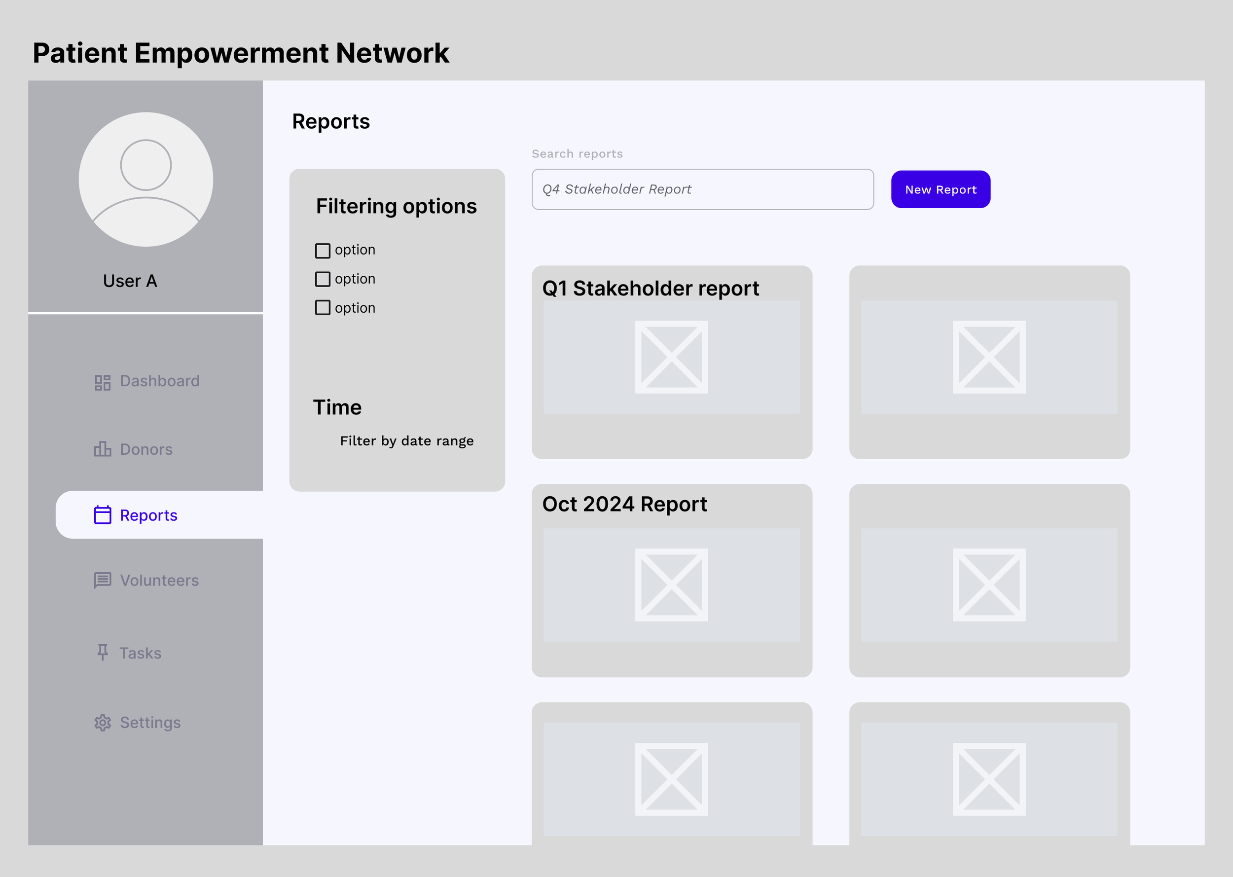
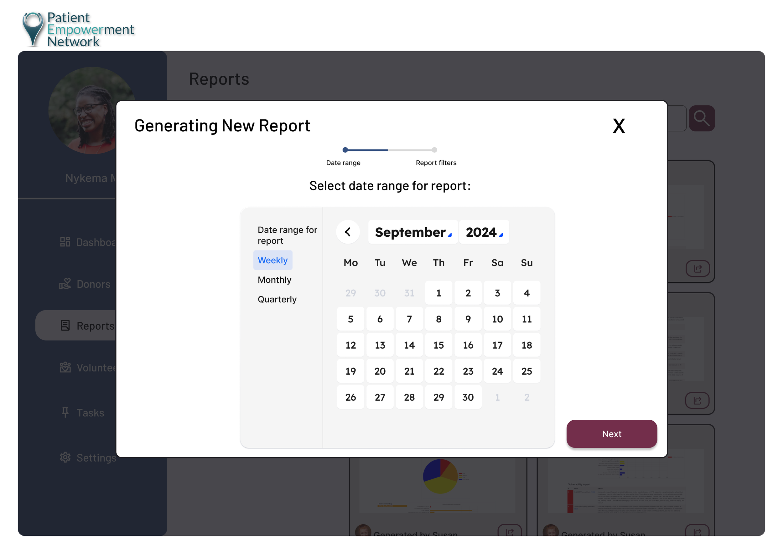
She also emphasized the importance of generating monthly, quarterly, and annual reports, so I made sure to include those date options in the reporting flow.
User Flows
Realtime Donation Tracking
In order to keep the dashboard simple and effective, I cross checked the prioritization of donation metrics with my client, to ensure that the key areas were being highlighted.
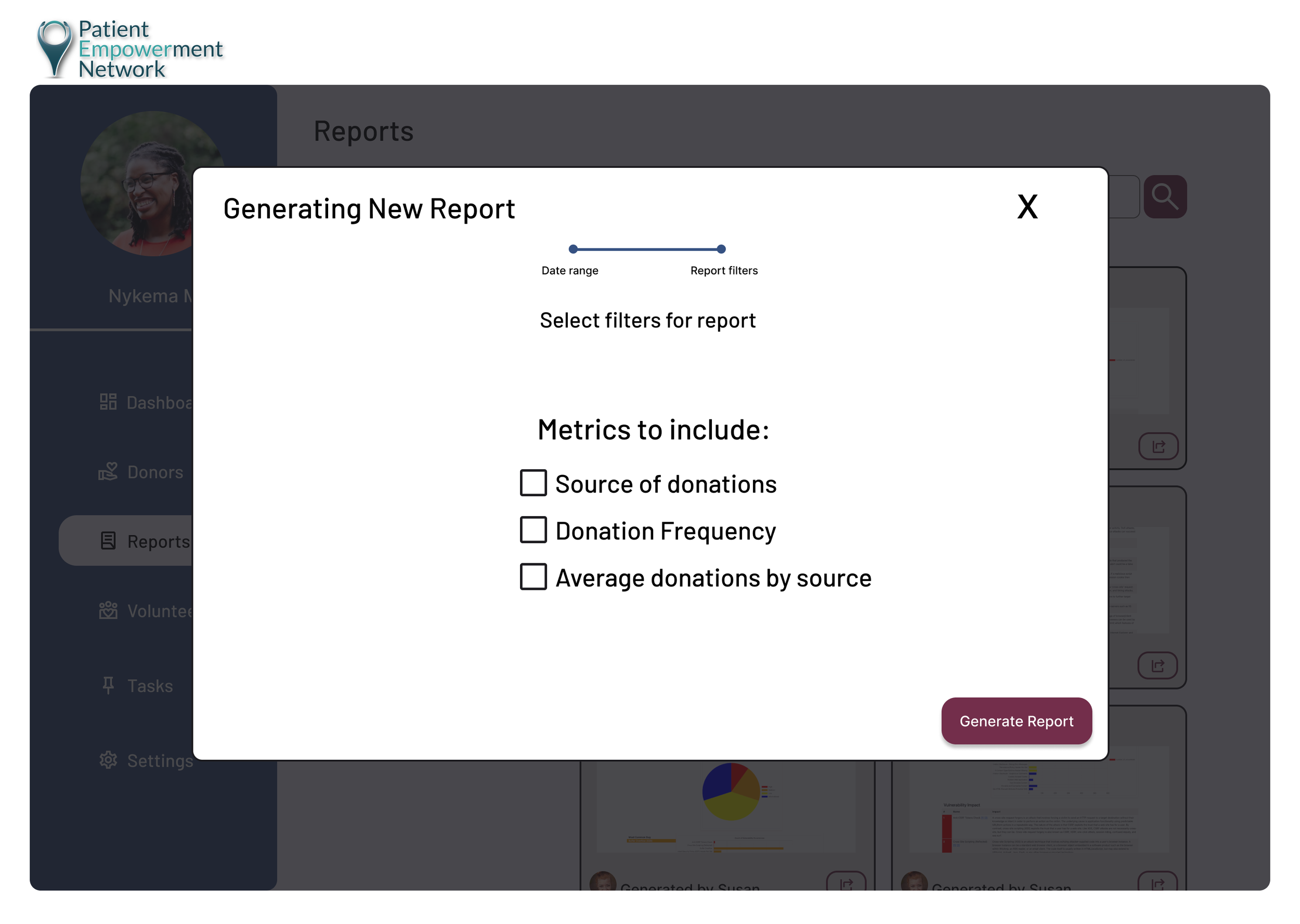
Generating New Donation Report
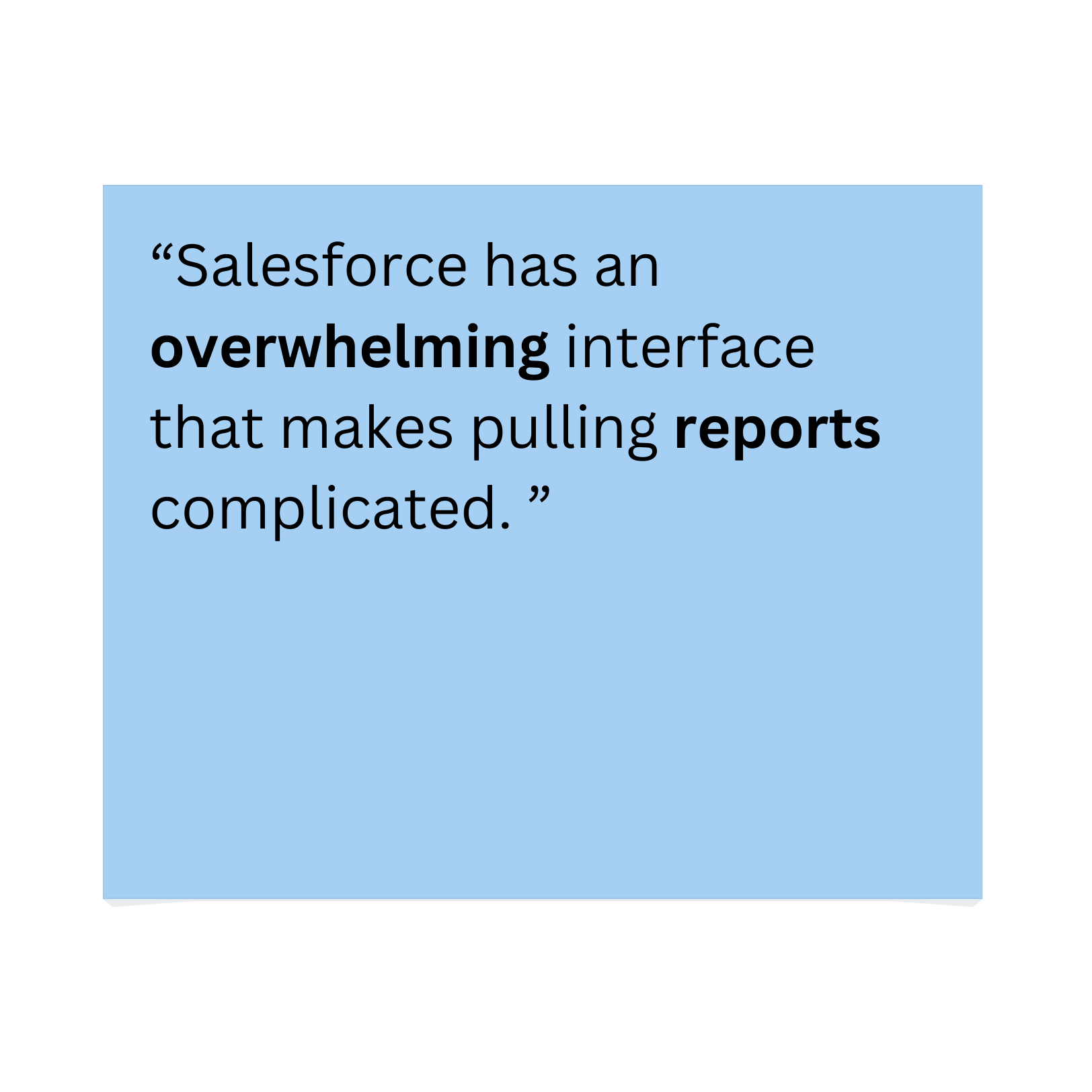
Overwhelming options and filters make generating reports in Salesforce difficult for the team. To address this, I simplified the process into a two-step flow: selecting a date range and key metrics that are most important to the client. Additionally, I included an export feature, as the client mentioned that downloading reports for easy access is helpful when pursuing corporate sponsorships.
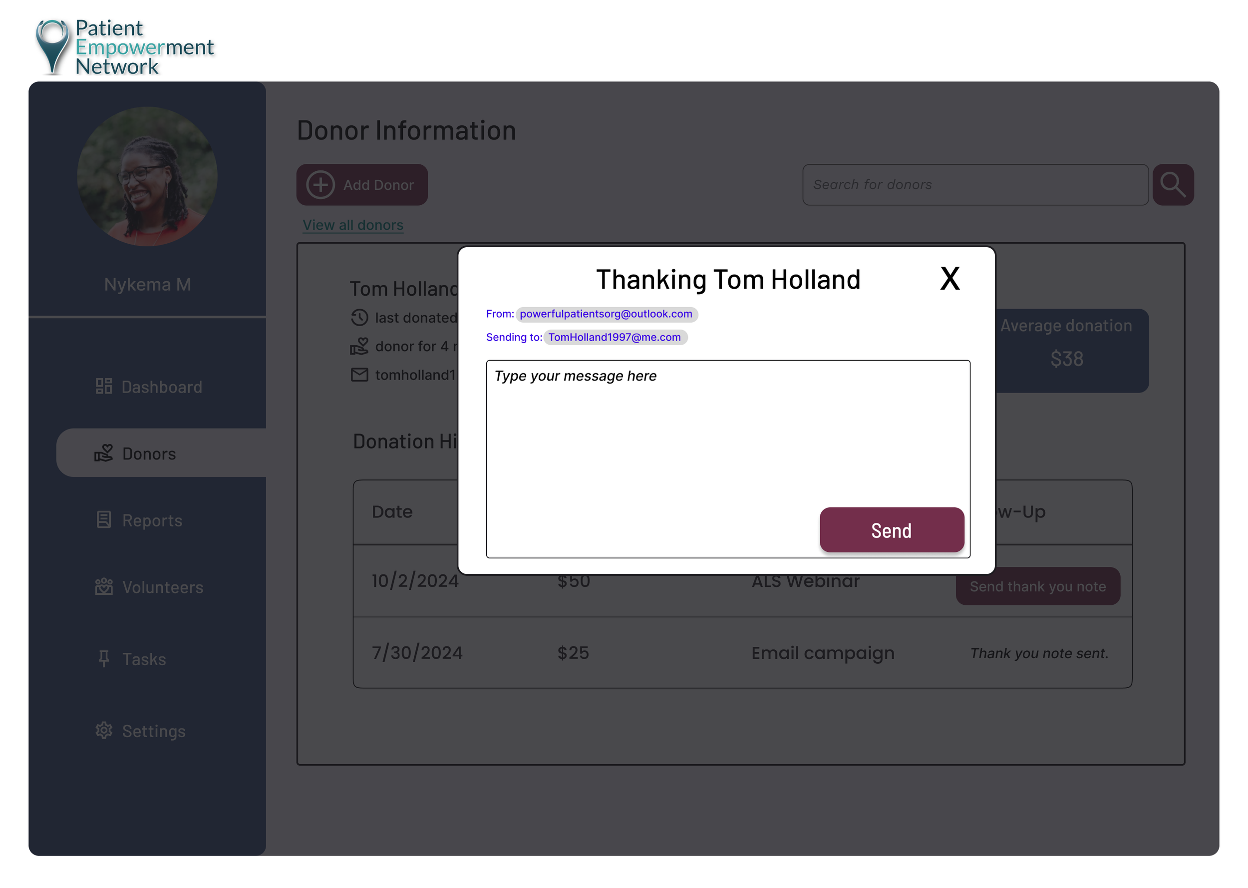
Sending Thank You Note to Donor
The decision to include a search and filter feature ensures that users can quickly locate donor profiles, improving efficiency for nonprofit staff. By enabling access to detailed donation history and contact information, users can tailor thank-you messages to foster stronger donor relationships.
Insights to Action
Sketches
I began with a modular layout to replicate the effective structure of traditional dashboards, providing a clear and intuitive pathway to key sections of the site.
This approach ensures users can quickly access important features and information without friction.
Narrowing a solution
Idea
I explored a mobile version of the healthcare nonprofit's platform to create a flexible, on-the-go experience for users. The goal was to provide coordinators with quick access to donor insights and key actions, such as sending thank-you notes or tracking donations, directly from their phones.
Why it did not work
After discussions with the client, I learned that their work is primarily desktop-based. Additionally, the client noted that older employees are less likely to adopt mobile solutions. This insight led me to refocus on designing for desktop, ensuring the final solution aligns with their existing workflows and meets the needs of their team.
What I learned
Always validate assumptions about device preferences early with stakeholders.
A good design solution prioritizes the user's context and tools they are comfortable with.
Low Fidelity Wireframes
Bringing the Vision to Life
Branding
PEN’s branding kit was provided by the client.
I chose a secondary shade of blue for the design to reinforce the Patient Empowerment Network’s core values of trust, comfort, and reliability.
For the interactive data tables and call-to-action buttons, I used primary colors to create contrast and enhance visibility, ensuring they effectively capture the user’s attention.
High Fidelity Wireframes
Validation in Action
Methodologies
I moderated usability testing with my client and observed how she navigated monitoring donation tracking, generating a new report and sending a thank you note to a donor.
Results & Revisions
The dashboard received a 4.5 out of 5 usability rating.
Client praised its efficiency, particularly its ability to streamline daily tasks and help her stay on top of key metrics.
Room For Improvement
The coordinator suggested labeling the real-time donation tracking to improve clarity for older users.
Iterations & Next Steps
What Went Well
To address the client’s concern for other employees - I added a label next to the metric pill group below the graph to clarify the available actions for users.
Next, I would like to conduct further usability tests with actual users, especially those who are older or less tech-savvy, to gather feedback on the time it takes them to complete daily tasks.
Furthermore, I would like to enhance the interactive data visualizations to ensure they are efficient in gathering key data to boost donation engagement.
Growing as a designer
This project pushed me to develop a deeper understanding of the nonprofit sector and donor management needs. It improved my ability to conduct focused research, synthesize insights, and design solutions that balance user needs with business goals.
I enjoyed the challenge of creating a meaningful tool that could positively impact an organization’s ability to help people affected by cancer. Working on the user research phase was particularly rewarding, as it allowed me to empathize with nonprofit professionals and see how my designs could make their workflows more efficient.
A challenge I faced in my process was prioritizing which features to include in the dashboard. With limited time, I had to focus on the most impactful elements while setting aside others for potential future iterations. Having my client look over the feature roadmap was a big help to ensure my designs were useful for her critical tasks. Additionally, understanding how Non-Profit Organizations (NPOs) track and calculate donation metrics, as well as effectively visualizing this data, presented a unique challenge. I used different web resources to verify my design decisions.


